Designing a better learning experience in the LMS website
Due to the company having 16 products, it was imperative that learners could easily identify and navigate to the correct courses for the products the were using on the LMS platform.
Sometimes learners were still unclear about course navigation when signing up to the site. There were also issues with some visual inconsistencies.
So I looked at how I could improve:
Visual consistency across the site
Clearer callouts and navigation
Any additional improvements that would be beneficial to the using the site
As a visual person I really enjoyed this challenge as I believe great visuals can provide a lot of value as well as creating a really enjoyable learning experience.

So how could we design the LMS platform to provide better direction to first time visitors?
Process
I focused on several key areas:
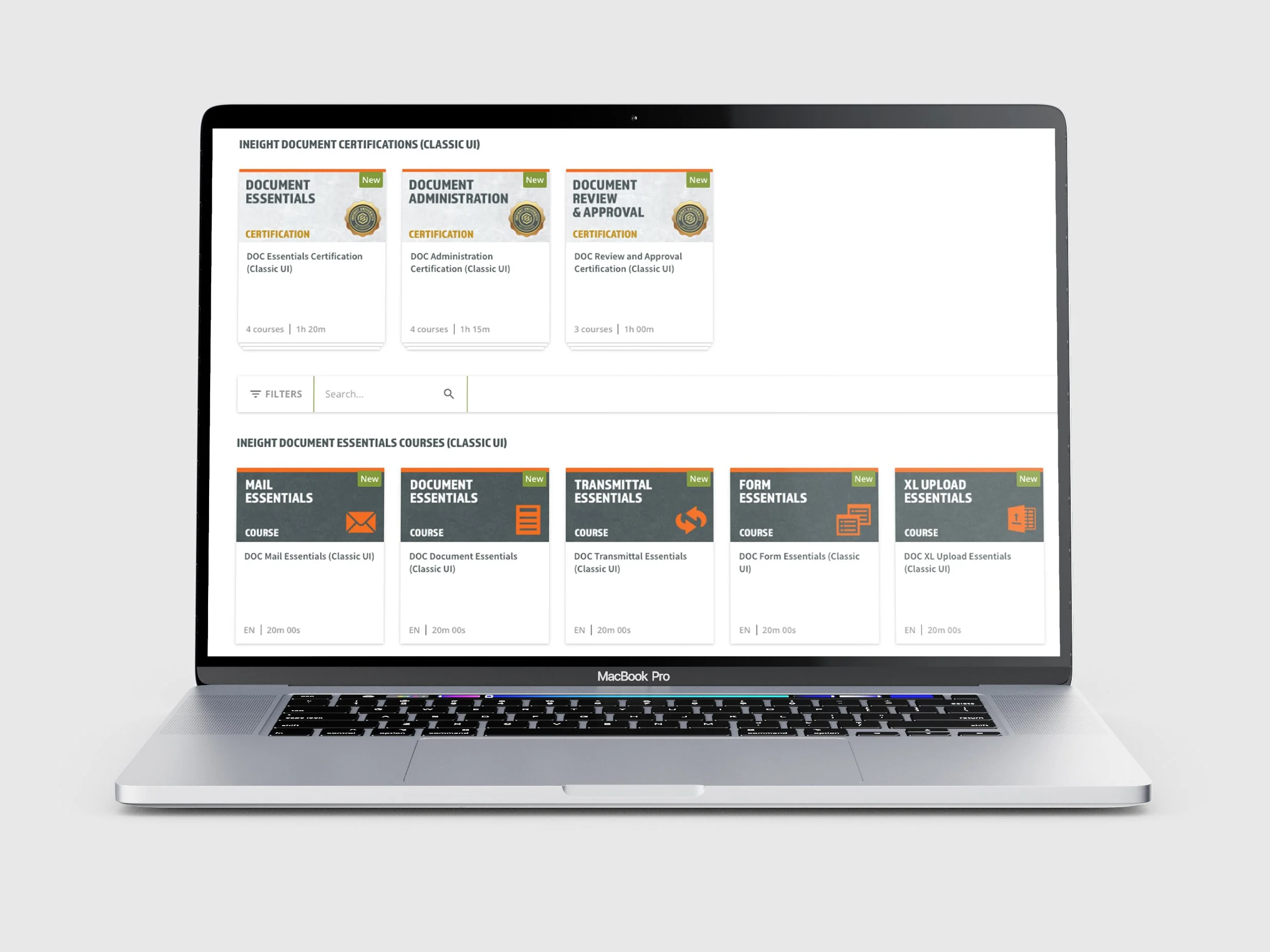
Visual consistency
Since there were no brand style guide developed for the look of the site, I started looking into what could be made more consistent including the home page, product pages, course thumbnails and course styling.
Clearer navigation
With 16 products it was imperative that new users could easily identify the training for each, so visual consistency in using the same colour as the icon of each product was key. On the home page, I included banners with some additional instruction on how access the courses. I also looked at consistent naming conventions of each course and added key words to make searching for specific courses easier.
Introduction video
To further assist learners coming to the site for the first time and to give them an overview of the process of how to access and complete a course, the team decided to create an overview video. So I developed the video from the script written by my manager.
Solution
-
![]()
Brand Guidelines
To ensure consistency for any future courses created, I designed a set of brand guidelines as well as templates for colleagues to use.
-
![]()
Consistent Branding
Consolidating the different visual looks into one consistent style allowed learners to clearly navigate between product pages and courses.
-
![]()
Thumbnail Style
I developed a thumbnail style to differentiate between a course, certification and webinar to ensure consistency and clarity.
-
![]()
Course Style
I ensured the correct font and colours were used. I also created a set of font sizes, similar to a website, so that the proper hierarchy of information was conveyed.


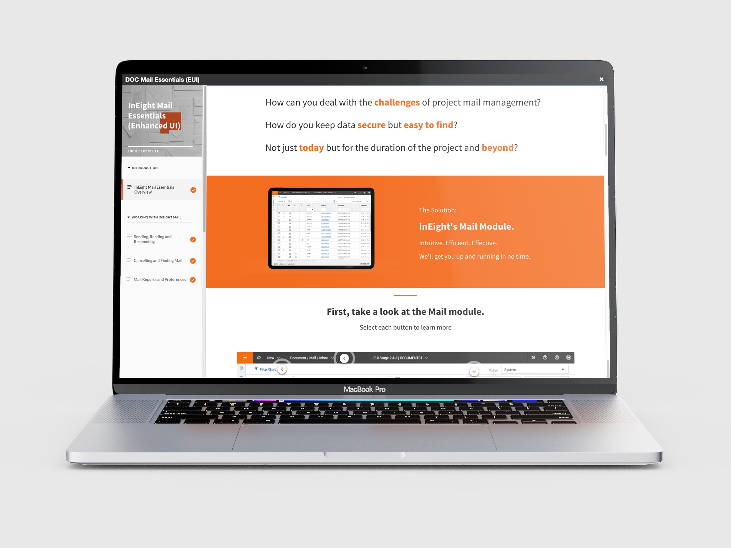

Introduction Video

Home page product cards

Course page branding